I think the 'Monster Insider' blog is a fairly visually appealing blog, in that it provides a clear reading space (the left column), while also providing a very interesting background image to the right that always remains visible regardless of scrolling.
Furthermore, the color scheme provides a clear contrast (white text on a black background for the body), with headers being easily discerned because of their different (but equally visible) color scheme (a soft yellow on black). Lastly, the concept art images provided in many of the updates make for visually appealing content, because it's much more fun to see what the new monsters will actually look like than to just read a textual description!
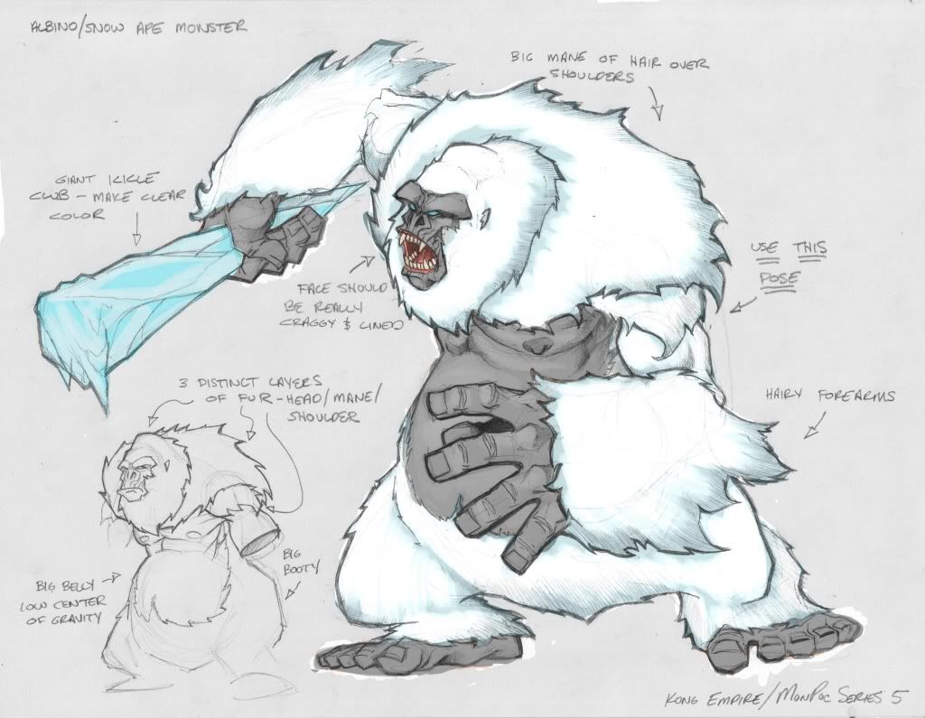
I mean, would you wanna read "We have a new giant yeti monster," or see this:
No comments:
Post a Comment