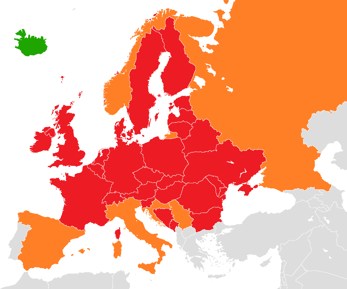
 European airspace completely (red) or partially (orange) closed to aircraft traffic on 18 April 2010.
.....this one caught my eye because of how basically it communicated the information using conventions widely understood. The only distinguishing features are the political boundaries of each country and uses a tri-colour scheme as the graphical coding. The omission of country name labels follows the heuristic of aesthetic minimalism, as any viewer familiar with the concept of a geographic map will easily be able to associate political boundaries with a country. Of course this is relying on conventions, although the conventions used are generally well understood. The tri-colour coding also takes advantage of convention, by using red to indicate air space closure (for example, like a stop light) and green to indicate open air space (green as in "go").
No comments:
Post a Comment