Thursday, April 29, 2010

Very informative volcano infographic comparison

Again, the topic of finance/money and business intrigue me. I found this cool infographic on one of the sites i visit.
I love this infographic because it not only gives me 'trivia' information on volcanoes, it illustrates the cost to travelers and other interesting information visualized with pictures.
I hope you all find this pretty cool to read.

*edit*
woops it looks like it gets cut off. Just click the image and it'll bring you to the full pic.

Volcanic Eruptions


Although this photo doesn't exactly explain why I wouldn't want to fly an airplane across the ash laden air, it gives me an idea of the magnitude of the eruption. Instead of just gaining facts, I gain somewhat of an emotional connection and can empathize with them.

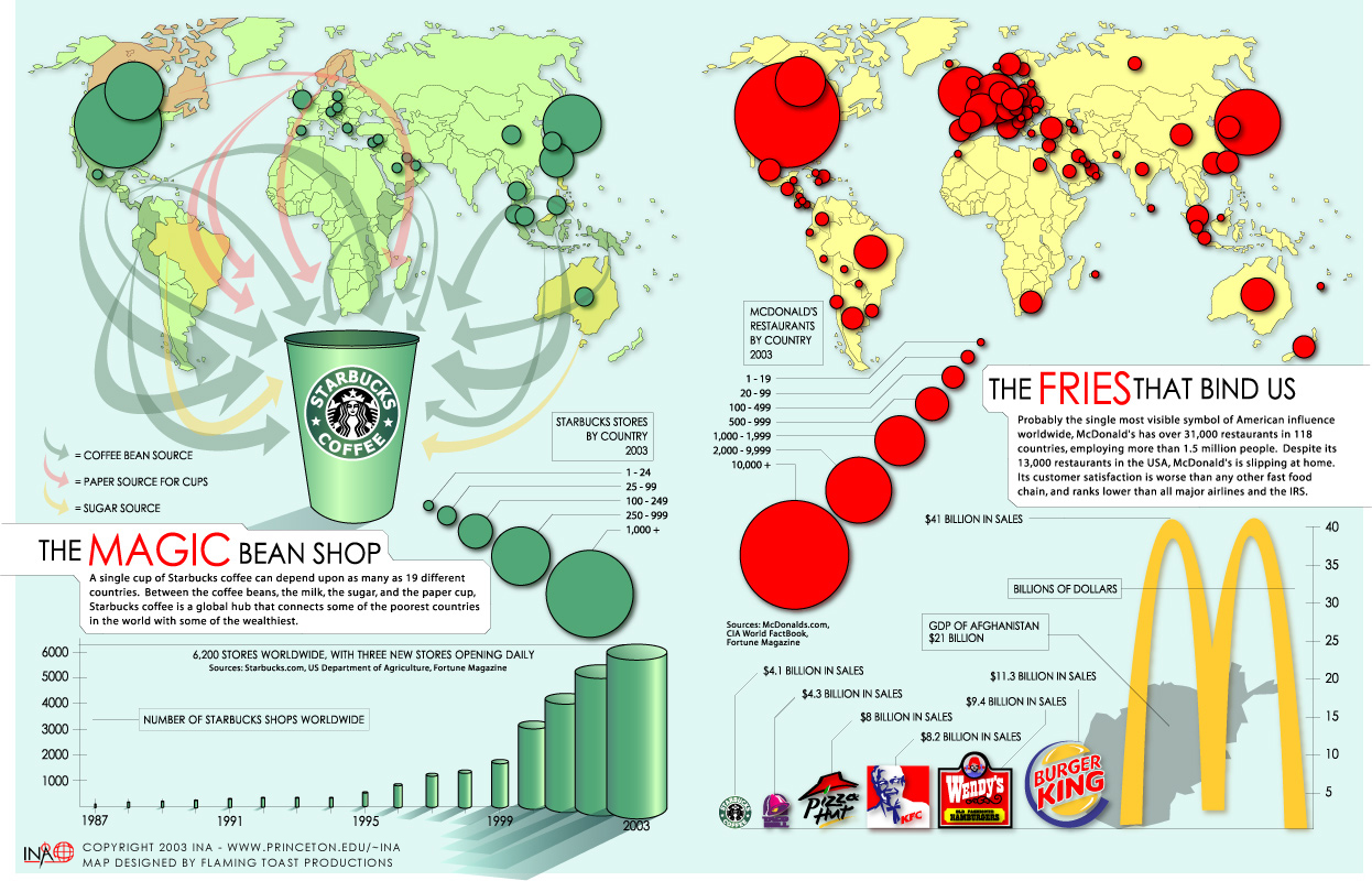
Number of McDonals and Starbucks Shops in the World


This infographic really caught my eye with the use of simple clean maps and graphs to give information about two industry giants. I really liked the map on Starbucks because it clearly explained and showed the main inputs that go into a cup of coffee and what country most of the material originates from. The map really helped show the global contribution to the company's products. I also liked the use of size on the map showing McDonald's, and found it a little more difficult to read because of the overlapping bubbles. However, it quickly made sense to me and really surprised me as to how many other McDonald's restaurants were spread across the globe, even in places like South Africa, and a few tiny islands that I cannot even name.

Volcano Visualization

Original source: http://en.rian.ru/infographics/20100419/158609048.html
Rehosted image: http://i13.photobucket.com/albums/a270/Insig/158654371.jpg

This map is one of many produced during the volcanic eruption in Iceland to show the airport closures caused by the ash cloud over Europe. I like this particular map because it shows (and, just as importantly, gives the names of) all of the countries that have closed or restricted their airspace. It also shows the general projected shape of the ash cloud. Each piece of the graphic is clearly labeled, and there are random interesting facts scattered around the image. Overall, it is just a very clean graphic that shows a lot of useful information without being too cluttered or dense.
"Iceland is one of the most geologically active areas in the world because of its' unusual placement between the North American and Eurasian tectonic plates. One-third of the Earth's volcanic activity has come from this area over the past 500 years."
This shows the cause of the rather frequent volcano activities in iceland. The red line caught my attention.

Visualization of Volcano-Free European Airspace

Airspace Rebooted from ItoWorld on Vimeo.


This visualization shows the air traffic around Europe during various stages of the volcano aftermath. This caught my attention because it was a flash movie and because it made me realize how much air traffic was affected.


Of the many airspace visualizations...

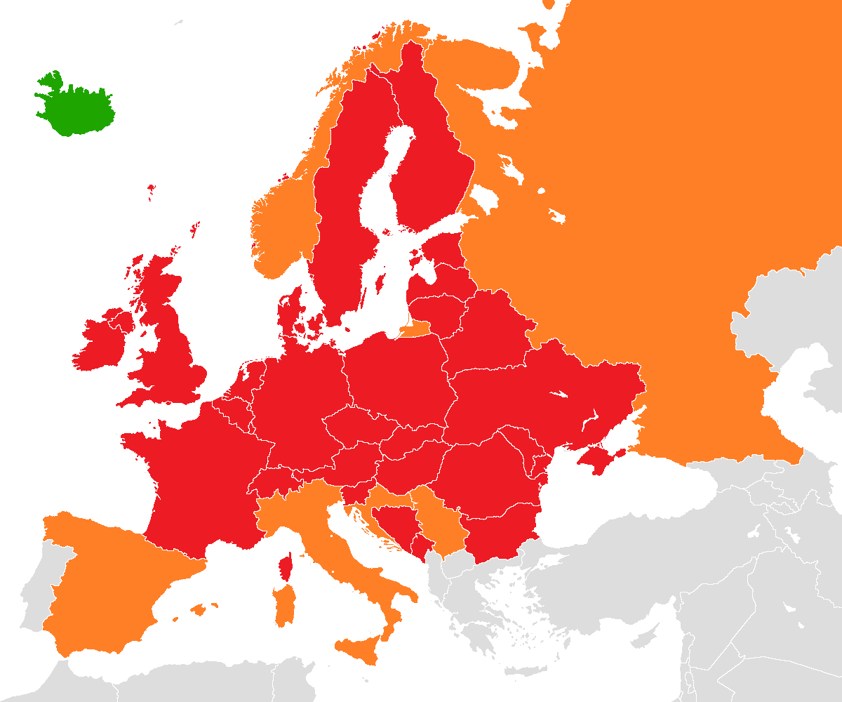
European airspace completely (red) or partially (orange) closed to aircraft traffic on 18 April 2010.

.....this one caught my eye because of how basically it communicated the information using conventions widely understood. The only distinguishing features are the political boundaries of each country and uses a tri-colour scheme as the graphical coding. The omission of country name labels follows the heuristic of aesthetic minimalism, as any viewer familiar with the concept of a geographic map will easily be able to associate political boundaries with a country. Of course this is relying on conventions, although the conventions used are generally well understood. The tri-colour coding also takes advantage of convention, by using red to indicate air space closure (for example, like a stop light) and green to indicate open air space (green as in "go").

SafeRoadMaps - Visualizing Car Accident Data

The visualization that I want to present this time is from SaferRoadMaps.org, a research project that was developed at the University of Minnesota to help visualize data that was collected about traffic accidents in a geographic sense. This system is powered by Google Maps and augments that functionality with additional filters and data to provide users with different kinds of insight into traffic accidents. Probably what interests me most about this visualization is the level of interactivity you have with it to find data. More on this after the photos:


Pictured above is a "crash density" map. The brighter the dots, the higher the collision rate. I depict Mainland U.S. here, but there are maps available for Alaska and Hawaii as well (which are also zoom-able to street level made possible by Google Maps).


Above is the same type of map zoomed-in over UCI. You should be able to click the picture to get a better look. At this level of detail, this map is similar to the Dr. John Snow's cholera map covered in lecture.


And the best for last, an example picture of what kind of data that can be augmented. You can click on accidents using the SaferRoadMap's "View Street Maps" tool to see data about any fatalities, ages of the people involved, if they have deceased, if speeding was involved, if drinking was involved, and the type of road it occurred on. This is one of the beauties of computerized visualization, as you can pack in this amount of data and still make it accessible on limited sized screens. Technology has also made it much more easier, if even possible, to aggregate and combine all these levels of data into one visualization.

To explain the filters that I have mentioned a little earlier (but not in the picture), you are able to directly type in addresses to auto-zoom to a relevant area on the map. You are also able to filter for driving laws (aggressive law, seat belt enforcement, etc.), road types, date types (summer or non-summer), speed types, drinking types, and restraint types. You are also allowed to filter results for people involved in collisions: Gender, Age, and if the person was a bicyclist, driver, passenger or pedestrian. Filters are accessible from the "View State Maps" link.

Blog #2 Web Trend Map of 2007


After looking for some interesting visualizations, this one caught my eye as by far the most intriguing and interesting. This visualization shows the 200 most successful websites pinned down on the Tokyo Metro Map. They are ordered by category, proximity, success, popularity and perspective. At first sight this map seems confusing but after looking at the key it is easy to read. The key shows how they distinguish the type of website, such as light pink for sharing websites and light green for news.The color scheme makes it easy to facilitate through the map and get a sense of which websites are popular and the connections between them. For example, if you follow the light green line you get all the news sites. Also, it shows another characteristic of the website which is the forecast and web X.X version. The forecast can be at different stages such as nice, insecure, or storm which demonstrate the six month prognosis for each candidate. The website version is stated because it gives an idea of which version companies are using and can be compared relatively to their success. For example, I noticed that all of the sites that are doing well are usually above 1.0 like eBay and Facebook. Overall, this visualization caught my attention because it showed so many relationships clearly all in one image by using different colors, shapes, sizes and lines.

BMW Hybrid Turbo Diesel Concept


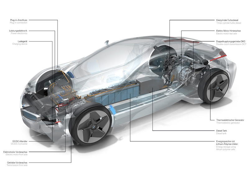
This visualization of the BMW Hybrid Turbo Diesel Concept was released to the public in September 2009 by BMW motoring and featured on Fastmotoring.com. The diagram shown is a somewhat modern representation of the concept vehicle and its components. What is particularly unique about this visualization is the use of opacity to highlight the inner mechanics of the vehicle. Instead of just a standalone diagram of the parts, the system is shown in relation to it's position relative to the chassis of the car itself. This is helpful in understanding the layout of the components with respect to the rest of the vehicle and put into perspective the order of processes that occur through them. The visualization gives users a sense of not only the inner mechanics of the vehicle, but the exterior design as well.

Movie Timeline


Full Size

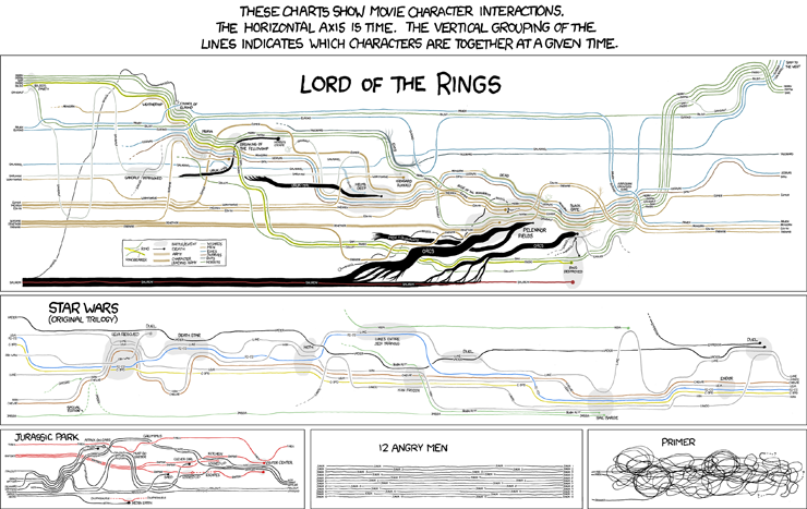
The main reason I found this visualization interesting was because of the movies presented and the subtle humor worked into the visualization. It is surprisingly effective though, and does a nice job of conveying what happens at what points.

Visualization of tweets


This visualization is a word cloud representing the discussion in tweets associated to starbucks. It caught my eye mostly because of its shape, which I thought was interesting. The size of the word represents the word's frequency. The size of a word is bigger when a word is used more often. It is also interesting to see the words people used.


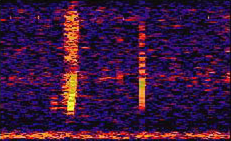
This is an image of a bloop, an ultra-low frequency sound that could be heard from 5,000 kilometers away. On the y-axis is the frequency of the sound, on the x-axis, time. The brighter, or more yellow the image, the louder the sound. This bloop in particular is so loud, that researchers have claimed that "not even a blue whale is large enough to croon this loud." Bloops are sounds emanating from the deepest parts of the ocean, parts we, as humans, haven't been able to explore yet. This visual is interesting to me because it's always interesting to find evidence of potential lifeforms and because this visual, while not visually appealing, can convey so much about the sound and pitch of a particular bloop.

Network Visualizations


Network visualizations are the best visualizations to show a web of connection between people. I find this network fascinating because of two reasons. One reason is because it reveals the true interlinked intimacy that all the students have with each other. However, it's also interesting because if the designer didn't specifically choose a network graph, the intimacy between the students would not have been revealed. For example, if we asked each person how many boyfriends/girlfriends they had and placed it on a bar chart, it would only tell us the average number of boyfriends/girlfriends these high schoolers have. It wouldn't have told us that most of these girlfriends/boyfriends they have are from the same group of friends. Thus, this graph is not only interesting by itself, it reveals the complexity of the decisions that information visualizers have to make.

Wednesday, April 28, 2010

Sex Ratio per Social Network


This visualization caught my attention because I have always found it interesting as to what type of people participate in which social networking sites. This visualization breaks down the ratio of women/men based over their ages between many of the commonly used social networking sites out on the internet. It is quite an interesting visualization because the longer you look at the graph you can find more and more interesting trends from this data.

Blogs between liberals and conservatives

This visualization caught my eye because it looks like a colorful sewing ball with those needles stuck inside it. There is actually a lot of data related to how big the blog is, what blog links to what, and what political affiliation of the blog.

I dont think this is a very good way of representing data concretely, because its hard to see how much bigger one blog is compared to another. Additionally, there are over 1200 blogs represented in this visualization -- good luck pinpointing any specific one!
The concept of "social pixels" is an emerging trend in visualizing conversations in social media such as Twitter. "Revisit" is a tool that shows real-time visualization of twitter messages with new messages popping out. I searched for conversations about the volcano and here is what I got. Another one is "Social Collider" that shows cross-connections between conversations on Twitter.


Why Gamers Play the Top 100 Games

This caught my eye yesterday, and being a gamer myself, I found it to be both interesting and humorous. Gamers are a very diverse bunch, so it's great to the distribution of that diversity (at least in terms of gaming interests). I'm well aware of how much gamers love competition, but it seems they love to save people (or the world) even more. Who would've thought? I also like how easy it is to view and understand this visual, with the colors being so bright and vibrant. It's also helpful that when they are used for the comparisons they are easy to differentiate from one another. I also like how it's just not one graph here, but several. The others are further breakdowns of other categories, including a statistic on the sort of person who needs the most rescuing. Less interesting, and more amusing for that visual.

Mapping the 7 Deadly Sins?

This visualization caught my eye because, well, it isn't something you would imagine to be done. A team at Kansas University utilized infographics to map out the 7 deadly sins across the United States by plotting per-capita stats on things that represent greed, envy, wrath, sloth, gluttony, lust, and pride. On the top is a scale, varying from "saintly" to "devilish" and using the change in color, from gold to burgundy, to represent that scale on the map. It's a very simple visualization but it was just interesting to know that you can pretty much map out anything you want. Who would have thought that someone would map out the sins committed in the United States? On one hand, you can view this visualization for what it is-a mapping of the seven deadly sins. At the same time, you can see what kind of crimes are most prevalent in which parts of the United States. It's truly amazing the kind of detail and message that can be embedded in visualizations.

http://www.wired.com/culture/education/magazine/17-09/st_sinmaps

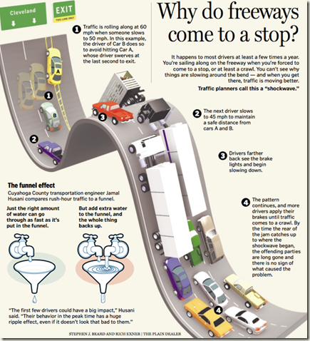
Why do freeways come to a stop?

20freeways

As a commuter student who drives at least 50 miles round trip every day, traffic is a huge annoyance to me. So much so that I avoid leaving campus until 7pm or later as often as possible. This infographic explains some of what happens to cause the ridiculous traffic jams of the 55 and 91 freeways.

It makes me extremely frustrated when I study traffic visualizations such as this one, because I realize how easy it would be for our freeways to be so much smoother, if only people weren’t so terrible at merging. Personally I believe merging should be given its own lesson in driving school, and people should fail their drivers test if the in-car tester thinks they’re terrible at merging. It’s a huge problem, and people waste terrible amounts of gas every day sitting in traffic that doesn’t have to be there.

Someday we will solve this problem…until then…please don’t suck at merging. :)

But Soft! What Light Through the Yonder Window Breaks?

Here is a small portion of a visualization titled "Chart of the proportions of rhyme, blank verse, and prose in Romeo and Juliet". (http://www.twelfth-night.info/clicknotes/romeo/Chart.html). This perspective of the play is interesting to look at because you can compare the composition of each act and scene and ponder what motives Shakespeare had for using rhymes or proses.

Of course there is nothing that can be done except speculate; did Shakespare simply feel like using about 14% (26 lines) rhyme in Act II Scene II, and then 100% (94 lines) rhyme in Act II Scene III? Or is it because the famous balcony scene is Act II Scene II, and thus the following scene is a fantasy world full of rhyme because Romeo is high from his moonlit meeting with Juliet?

Tuesday, April 27, 2010

Icelandic Volcano Effects


For this post I chose an image from space that shows the thickness of clouds. As you can see from the visualization, the ash and smoke from the volcano has created dense clouds that make air travel impossible. The winds have blown the clouds to the south east of the volcano. Air travel may be possible if the clouds were blown north west (sparsely populated areas) instead of south east (towards the rest of Europe). This visualization does a good job of integrating colors and geographical placements. The darker the color, the more dense the clouds are at that location.

SO2 Content

This is a Satellite view of the sulfer oxide (SO2) content. The visualization shows the amount of SO2 is being released on the planet over the northern hemisphere. In the grand scheme of things it is a very small amount being released but is evident if you know where to look. There are other area's in Russia where there is possibly more SO2 being released then by the volcano. The volcano differs in that it is a single source of SO2 where the many blips are likely numerous factories or other activities causing it.

A Collage of the Iceland Volcano's Affects

The Wall Street Journal(http://online.wsj.com/search/photo.html?KEYWORDS=volcano) presents a plethora of browseable pictures about the Iceland volcano. The visualization is not any single picture; rather, it is the collage of pictures that makes up the visualization.
By scanning the pictures, you can see how the volcano has affected everything from aviation to the restaurant industry in Hong Kong. I like the pictures that have people in them because they give the impact of the eruption a sense of humanity; that is, the volcano's impact is not just a matter of number and statistics.

Improved Oil Standards


This visualization shows the spectrum of standards set for engine oil. The blue represents GF-4, the current standard for oil, the red represents GF-5 which is the new oil standards set to go into effect on October 1, 2010. This web chart helps compare the current oil standards with the new ones. It's a great way to see the difference between the two standards relative to each performance parameter. There is also a video available with this graphic which shows the impact of the trade-offs faced in trying to incorporate all the parameters while making engine oil.

Monday, April 26, 2010

Smoking

(Visualization is cropped form the left automatically by the blogsite; please click on the image to view the original image)

The following visualization displays the various ingredients and products used to make a cigarette. The visualization offers convincing proof to smokers of the dangers embedded within a single cigarette and helps them quit smoking. It also rightfully deflects non-users to smoke again by showcasing the harmful materials involved in making a cigarette.

Some of the ingredients are displayed with dangerous symbols while some are also labelled with 'supposed' inedible substances and also toxic substances which further adds to the effect of disabling smokers and preventing non-smokers to begin smoking.

Area of Effect from the volcano over time


I thought this visualization is interesting in that it provided the effect of the volcano over a period of time. Instead of just showing the total area affected or the area affected as time passes, it shows the area that are affected the most amount of time by the overlapping shades. 

The visualization might not be as useful in telling how much impact the volcano had on the area as an area that is affected by large particles or more particles is not differentiated from an area that is just barley affected. Nonetheless, it might prove to be useful to some people. I do think a color change or a better contrast of the shades of gray would have worked better than the current model though.


The global impact of Iceland’s volcano

The graph is from Muckety Website

From this interesting visual, I could recognize the volcano in Iceland has brought the butterfly effect to the globe. When I first time heard about Iceland’s Eyjafjallajokull volcano eruption 2010, I would not realize it could cause a great deal of disruption around the world. Because I understand the eruptions of volcanoes are just one kind of natural disaster on our earth, I have not thought deeply before the butterfly effect diagram caught my attention. This is one of the good visuals I have read about the Eyjafjallajokull volcano eruption. The audiences could easily recognize what kind of organizations or countries have been affected by the cloud of ash from Iceland’s volcano. There are solid lines and dotted lines all over the diagram. The solid lines represent that there are current relations between the volcano eruption and companies or organizations, such as Fedex Corporation has been prevented shipping to and from Europe recently, and the Eurozone’s economy has been decreased. The dotted lines show the former relations, such as the airlines have been cancelled and cost at least $200 million a day. Generally, this visual is well-organized and informative. It could catch audiences’ eyeballs by this butterfly diagram.


Sulfur Dioxide Plume from Iceland Volcano

The following 2 visualizations show the sulfur dioxide concentration data of the Iceland Volcano from the NASA Aura/OMI satellite sensor. The NASA OMI sensor "can distinguish the differences between cloud, smoke, dust, ozone and other aerosols, and is important in Earth observations for aviation safety." These 2 visualizations in particular caught my attention because these past 2 weeks my car has been at the dealership awaiting a part from Germany and I've been told that the airplane the part is currently on is grounded. Reading the previous posts, I understood the dangers of planes flying around Iceland but didn't understand why planes in Europe were grounded. It wasn't until I saw these images of the plume that I now see how far reaching the volcanic plume is.


Iceland Volcano

I found a series of interesting images on NASA's website regarding the eruption of Eyjafjallajokull volcano in Iceland. These visualizations caught my attention because they're in a chronological order thus I was able to observe and see the changes as days go on. Most of the images are accompanied by labels to identify the different parts of the eruption captured by the satellite.

http://earthobservatory.nasa.gov/NaturalHazards/event.php?id=43253

Google Trends

Unlike many of the blogs for this week, mine won't be about the volcano. Instead, I'm going to talk about Google Trends. Google Trends is dedicated to providing data and visualizations about current hot topics in the world (or specifically USA, your choice). These topics are chosen by how many people have searched (or "googled") these topics in the past few hours.

Strangely enough, I came across this from Yahoo. Like many nights, I checked out the Yahoo homepage for news, when I saw an article written about the new show, "Into the Universe with Stephen Hawking", on the Discovery channel. It premiered last night and I forgot to record it.
So, like most college students, I went and googled it, hoping someone might have posted it online or that maybe I could torrent it. But it must have been too soon after the broadcast, cause I couldn't find a thing.

However, I did notice that when I had googled the show's title, google had a separate box from the search results, revealing that this search was considered a "hot topic" in the last few hours. I followed this link to a page in Google Trends, which provides for the search topic, a graph (detailing search activity), a ranking of "hotness", a list of news results, a list of blog results, web results, and a list of other current hot topics. Below is a screenshot from right now, and as you can see, Stephen Hawking is no longer as popular as he was yesterday.
Google never ceases to amaze me. I think in this particular case, its a handy way to find out what's new and popular; a new way to get the very latest news. And in this particular case, it was fun to see what the public's reaction to the show was. The majority of the news and blogs seem to be more than a simple critic over last nights show, but deeply discusses one of Hawking's personal theories about aliens. It's not exactly what I was looking for at the time, but it was interesting to find out.

In addition, Google Trends have several other visualizations in the form of charts. Some of which compare search terms to one another, based on popularity, and based on location. In searching for Stephen Hawking, it seemed he was very popular in Peru for some reason. I invite everyone to go check it out and explore what the "hot" topic of the hour is.
A team has compiled numerous high resolution images of the volcano. http://www.physorg.com/news191248302.html. Most have been taken from a satellite, giving a unique view of the cloud as compared to what we see from the ground. The most interesting thing I found with this heat map visualization is the finding that as "the volcano's infamous ash plume is receding, its internal temperature is rising.". What this means is that just looking at the cloud, we would think things are getting better because it is getting smaller, but thats not the case and we must be even more cautious about what flys through the ash. The heat-map gives us a different view of the ash, and allows us to analyze more indepth.

Sunday, April 25, 2010

Tracking Airport Status

Tracking Airport Status

This is a link from the NYTimes that shows an up to date visualization of the major airports in Europe along with their flight statuses. They can either be green (Only flights to or from affected areas canceled), yellow (Some flights operating), or red (All flights canceled). This type of color coordinating is a typical heuristic for signifying whether something is working (green), partially working (yellow), or not working at all (red). This graphic also links the users to the airports homepage as well to get even more information about a certain airport. The graphic is also updated in real time so the image you see today may not necessarily be the image you see tomorrow, but from here on out it looks like all the airports will remain green.

Saturday, April 24, 2010

Eyjafjallajökullv Eruption

http://www.zerohedge.com/sites/default/files/images/user5/imageroot/paulson/smoke.gif (Right click the picture and select view image info to restart .gif if it's not working.)

This visual caught my eye with its depiction of the extension of the smoke plumes over Europe and into Northern Asia as well as parts of Northern Africa and into the Atlantic Ocean. It clearly shows the eruptions effects from start to most recent image on the 18th of April. The way that the gif is organized, the area the plumes cover and how much heat is built up in each region is very easily visible. With this info, it would not be hard to convince the average bystander that it would be dangerous to fly anywhere until the smoke plumes clear up.

From: http://images.google.com/imgres?imgurl=http://hraun.vedur.is/ja/myr/num2009-2010.gif&imgrefurl=http://julezedward.wordpress.com/&usg=___BvyC8c0KN16HIhxz7JFx1EQX0k=&h=480&w=640&sz=9&hl=en&start=305&um=1&itbs=1&tbnid=LEXi5ejTPXYaBM:&tbnh=103&tbnw=137&prev=/images%3Fq%3Diceland%2Bvolcano%2Bvs%2Bworld%2Bair%2Btraffic%26start%3D300%26um%3D1%26hl%3Den%26client%3Dfirefox-a%26sa%3DN%26rls%3Dorg.mozilla:en-US:official%26ndsp%3D20%26tbs%3Disch:1

Friday, April 23, 2010

Volcano Visualizations

I found a few interesting visualizations on the Icelandic volcano at http://news.bbc.co.uk/2/hi/8623534.stm. There was a series of 4 images over a span of about 24 hours showing the ash moving around Europe in the 20-30,000 foot range. What caught my attention was the comparisons you are able to make since there are a series of visuals. Plus it is amazing to see how far reaching the effects are. It's easy to see on the news that airlines in Europe are shut down, but the visualization makes it real and more shocking to see the effects of one small island volcano.


Thursday, April 22, 2010

The volcano in Iceland has caused a great deal of disruption around the world. I have noticed some good visuals though not as many as I might have expected. For this week's blog exercise, try to post an interesting visual and at least a few sentences why it caught your attention.

For example, of all the images related to the volcano, I found the following the most useful in that it explained why I wouldn't want planes flying through the ash laden air. It's from The Washington Post online.

Tuesday, April 20, 2010

Color Blindness!

Unrelated to the blog assignment, but related to our class discussion today, Dinosaur Comics for today was about color-blindness. It's pretty awesome, you should check it out.

Dinosaur Comics FTW

Texts From Last Night

When it comes to blogs that keep your attention and even provide yet another means of procrastination in this already cluttered world, a few top the charts: Failblog, FMyLife, MyLifeIsAverage, etc. One of these toppers hits the sweet spot on many occasions. TextsFromLastNight.com is one of the most hilarious sites on the web.

Visually I almost never even notice that there is anything special about it. On closer inspection, however, it would seem that the site is very well planned in its means of catching the readers attention. To start, all of the information that could other distract the reader is at the very top. There is no information that would point far away from the main idea of the site. There are a few adds at both the top and the bottom of the page as well as at the right side of the page. Even in these areas, there are more resources that could help better ones experience on the website rather than distract. The ads are on a side of the page that the eyes of the reader are quickly shown is not very necessary to even glance at.

As one analyzes that manner of information distribution across the page, it is quickly noticeable that only information pertaining to the site itself is made to stand out. The buttons "Best, Worst, and Random" are made to pop out of the screen in comparison to the rest of the page with their matching button background but stand alone red coloring. The name of the site is advertised better than anything else on the whole page. And yet with all of these, if one scrolls down the page even a little, all of these things disappear from site and the only thing that matters anymore are the actual texts.

The creators of the site planned very well with this as they chose to make every text short and sweet. It works in their favor that most texts are not more than 160 characters anyway. Their means of showing how each person that submitted the text is is very well thoughtout because it allows the readers to connect with the person that submitted it if the submitter was in the area, and ignore it otherwise. The reader can also return to a submission they made without much difficulty.

Overall the page is clear-cut and keeps the readers attention for far longer than could possibibally considered necessary.

Autoblog - The blog for car enthusiaists


I'm a big fan of autoblog, not just because I'm a car enthusiast , but also because this blog lays out information in a very easy to reach manner. It enables the user to search the blog for news by car make and model. The blog's content covers every part of the auto industry - from budget cars like Kia to exotic concept cars like the Citroen Metropolis. Each post is accompanied by pictures that can be viewed in a gallery. The blog is so fast paced, that it has added a feature called "Daily U-Turn" which contains all popular news stories of the day.


Dumb Little Man

I really enjoy reading the blog DumbLittleMan: http://www.dumblittleman.com/
One of the first things that really caught my eye in this blog was part of the header which says the following:

Welcome to Dumb Little Man! Each week we provide a handful of tips that will save you money, increase your productivity, or simply keep you sane

I thought it was pretty funny, and I felt this site could be applicable to me because I need to save money, not procrastinate, and stay sane too. The blog talks about different tips and tricks to helping individuals out in their daily lives and can range from self help to money saving and how to be a happier person. I enjoy reading these mainly because they have these tips that I never would have thought about on my own that I can easily apply to myself and my life.
I feel that the blog does an excellent job of linking their titles to a themed picture. By quickly scrolling up and down the page, a reader can quickly asses the different new articles available and choose which one he/she wants to read. There was one that especially caught my eye today as I quickly browsed which talks about 5 extraordinary benefits of martial arts. The title alone probably wouldn't have attracted me while i was quickly skimming, but the picture made me stop for a second since I used to take martial arts and was curious as to what the authors had to say about it. The layout is very simple and efficient, allowing readers quick access to whatever they please, which is a large contributor to why I really enjoy reading articles from this site.